

Category: Spreadsheets

Graphing–9 Lesson Plans + 6 Online Resources

Graphing is an important skill for students whether they go to college after High School or start a career. It teaches:
- Visualization and Understanding: Graphing helps students visually represent data, functions, and relationships. This visual representation often aids in understanding complex concepts that may be difficult to grasp through purely symbolic or verbal explanations.
- Problem Solving: Graphs provide a way to solve problems and make predictions. Whether it’s analyzing trends in data, finding optimal solutions in optimization problems, or understanding the behavior of functions, graphing is a valuable tool for problem-solving.
- Communication of Ideas: Graphs provide a universal language for communicating ideas across different fields. Whether in mathematics, science, economics, or engineering, graphs are commonly used to convey information in a concise and understandable manner.
- Critical Thinking: Interpreting graphs requires critical thinking skills. Students learn to analyze and interpret data, identify patterns and trends, and make inferences based on the information presented in the graph.
- Preparation for Higher Education and Careers: Graphing skills are fundamental in many higher education disciplines and careers. Whether students pursue studies in STEM fields (science, technology, engineering, and mathematics), social sciences, or business, they will likely encounter situations where graphing skills are essential.
- Technology Proficiency: With the prevalence of graphing software and tools, teaching graphing also involves teaching students how to effectively use technology to create and analyze graphs. This proficiency in using graphing software is beneficial in both academic and professional settings.
- Promoting Creativity: Graphing can be a creative process, particularly when students are tasked with representing data or functions in innovative ways. Encouraging creativity in graphing assignments can make the learning process more engaging and enjoyable for students.
I start students in 2nd grade with a spreadsheet program. Here are some of the lessons I teach (available for free on Ask a Tech Teacher): (more…)

#72: How to Check Your Math in a Spreadsheet

Over the next few months, we’ll provide a series of lessons on spreadsheet basics you can use in your K-8 classroom. Here are some of the topics we’ll cover:
- #74: Mastering Excel (for Beginners)
- #71: Beginning Graphs in MS Excel
- #70: Create a Timecard in Excel for Grade Two and Up
- #73: How to Graph in Excel
- #12: Create Simple Shapes in Excel
- #75: Tessellations in Excel
- #72: How to Check Your Math in Excel
- How to Use Excel to Teach Math Arrays
- #62: Email from Word (Or PowerPoint or Excel)
- #79: Excel Turns Data Into Information
Today:


–from 55 Technology Projects for the Digital Classroom
–image credit Deposit Photos

Here’s the sign-up link if the image above doesn’t work:
https://forms.aweber.com/form/07/1910174607.htm
Copyright ©2024 worddreams.wordpress.com – All rights reserved.
“The content presented in this blog is the result of my creative imagination and not intended for use, reproduction, or incorporation into any artificial intelligence training or machine learning systems without prior written consent from the author.”
Jacqui Murray has been teaching K-18 technology for 30 years. She is the editor/author of over a hundred tech ed resources including a K-12 technology curriculum, K-8 keyboard curriculum, K-8 Digital Citizenship curriculum. She is an adjunct professor in tech ed, Master Teacher, webmaster for four blogs, CSTA presentation reviewer, freelance journalist on tech ed topics, contributor to NEA Today, and author of the tech thrillers, To Hunt a Sub and Twenty-four Days. You can find her resources at Structured Learning.

Tech Tip #57: How to Create a Chart Really Fast
As a working technology teacher, I get hundreds of questions from parents about their home computers, how to do stuff, how to solve problems. Each Tuesday, I’ll share one of those with you. They’re always brief and always focused. Enjoy!

Q: What’s the easiest way to introduce 3rd graders to Excel charts?
A: When students have gone through the spreadsheet basics and feel like that scary interface (with the blank boxes and letters and numbers) isn’t so scary, you’re ready to create a chart. Collect class data. Highlight the labels and data and push F11.

#75: Tessellations in Excel
Tessellations are repetitive patterns of shapes that cover a surface without overlapping. With Excel (or another spreadsheet program), you can create tessellations by arranging shapes in a grid and using formulas and formatting options to make the patterns visually appealing. Here’s a step-by-step lesson plan to use Excel or another spreadsheet program to teach tessellations:
(more…)

#71: Beginning Graphs in MS Excel

Excel makes graphs simple and easy for beginners. Even my parent helpers are amazed at how much students can do with a simple F11 shortkey and a right click. This lesson plan works just as well with Google Sheets though you may have to adapt a few of the instructions.
Over the next few months, we’ll provide a series of lessons on spreadsheet basics you can use in your K-8 classroom. Here are some of the topics we’ll cover:
- #74: Mastering Excel (for Beginners)
- #71: Beginning Graphs in MS Excel
- #70: Create a Timecard in Excel for Grade Two and Up
- #73: How to Graph in Excel
- #12: Create Simple Shapes in Excel
- #75: Tessellations in Excel
- #72: How to Check Your Math in Excel
- How to Use Excel to Teach Math Arrays
- #62: Email from Word (Or PowerPoint or Excel)
- #79: Excel Turns Data Into Information
If the lesson plans are blurry, click on them for a full size alternative. (more…)

#72: Check Your Math in Excel
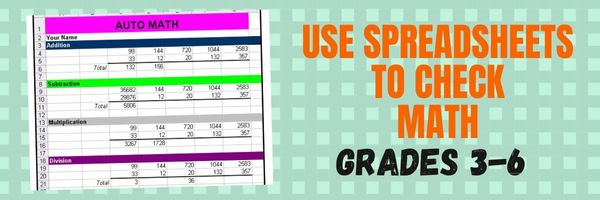
This is one of the most popular lessons I teach to Excel beginners. It is relevant, instantly usable and makes sense from the beginning. Click the images below to enlarge them for viewing.
[gallery columns="2" ids="45219,45218"]–from 55 Technology Projects for the Digital Classroom
Copyright ©2023 usna.wordpress.com – All rights reserved.
Jacqui Murray has been teaching K-18 technology for 30 years. She is the editor/author of over a hundred tech ed resources including a K-12 technology curriculum, K-8 keyboard curriculum, K-8 Digital Citizenship curriculum. She is an adjunct professor in tech ed, Master Teacher, webmaster for four blogs, an Amazon Vine Voice, CSTA presentation reviewer, freelance journalist on tech ed topics, and author of the tech thrillers, To Hunt a Sub and Twenty-four Days. You can find her resources at Structured Learning.

How to Use Excel to Teach Math Arrays

Over the next few months, we’ll provide a series of lessons on spreadsheet basics you can use in your K-8 classroom. Here are some of the topics we’ll cover:
- #74: Mastering Excel (for Beginners)
- #71: Beginning Graphs in MS Excel
- #70: Create a Timecard in Excel for Grade Two and Up
- #73: How to Graph in Excel
- #12: Create Simple Shapes in Excel
- #75: Tessellations in Excel
- #72: How to Check Your Math in Excel
- How to Use Excel to Teach Math Arrays
- #62: Email from Word (Or PowerPoint or Excel)
- #79: Excel Turns Data Into Information
Today:
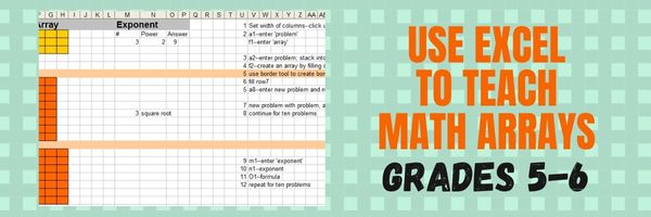 Grade Level: 5th (or whichever grade you are teaching arrays)
Background: None. This is an intro to MS Excel or spreadsheets
Vocabulary: Excel, cell, rows, columns, paint bucket, borders, arrays, resize, formulas
Time: About 30 minutes
Steps:

How to Keep a Timecard in Excel
One of the most popular applications of math is through spreadsheets (like Excel) that make those numbers relevant to everyday life. We’re going to provide a series of lessons on spreadsheet basics you can use in your K-8 classroom. Here are some of the topics we’ll cover:
- #74: Mastering Excel (for Beginners)
- #71: Beginning Graphs in MS Excel
- #70: Create a Timecard in Excel for Grade Two and Up
- #73: How to Graph in Excel
- #12: Create Simple Shapes in Excel
- #75: Tessellations in Excel
- #72: How to Check Your Math in Excel
- How to Use Excel to Teach Math Arrays
- #62: Email from Word (Or PowerPoint or Excel)
- #79: Excel Turns Data Into Information
Today:
This project (#70 in the collection of #110) hides a spreadsheet’s power behind a template you create and students fill out at home. If they’re older and more familiar with spreadsheets, involve them in creating the template. If the lesson plans are blurry, click on them for a full size alternative.
Note: The example uses Excel, but it works just as well with Google Spreadsheets.


Tech Tip #57: How to Create a Chart Really Fast
![]() In these 169 tech-centric situations, you get an overview of pedagogy—the tech topics most important to your teaching—as well as practical strategies to address most classroom tech situations, how to scaffold these to learning, and where they provide the subtext to daily tech-infused education.
In these 169 tech-centric situations, you get an overview of pedagogy—the tech topics most important to your teaching—as well as practical strategies to address most classroom tech situations, how to scaffold these to learning, and where they provide the subtext to daily tech-infused education.
Today’s tip: How to Create a Chart Really Fast
Category: MS Office, Google Apps
 Q: What’s an easy way to create charts?
A: When students have completed spreadsheet basics, they’re ready to create a chart:
- Collect class data on a spreadsheet.
- Divide into categories.
In Excel: Highlight the labels, categories, and data; push F11. That’s it–a simple chart.
In Google Spreadsheets: Use the icon on the toolbar.
Sign up for a new tip each week or buy the entire 169 Real-world Ways to Put Tech into Your Classroom.
What’s your favorite tech tip in your classroom? Share it in the comments below.

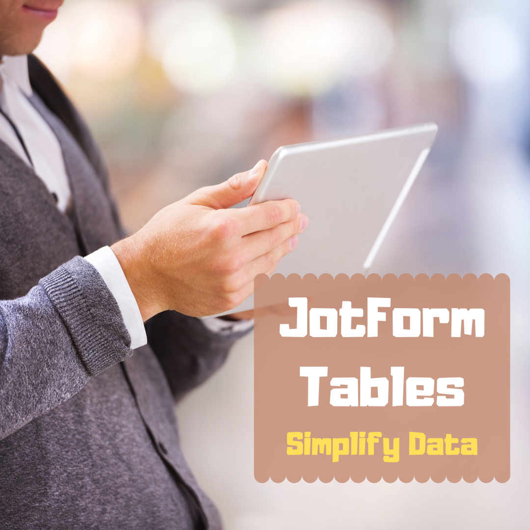
Long-needed and Welcome Table Tool From JotForm
 Education has changed. No one knows yet if it’s for better or worse but we all understand that nothing’s as it once was. That means many traditional teaching tools are no longer the best choice for the new norms. Over the past few months (well, since March), I’ve spent a lot of time reinventing my teaching protocols, doing a rigorous evaluation of whether my standard practices are best suited for the new best practices for teaching at home and school (click here for lots of info on COVID-19 and education). Because often, I’m not physically with students to help with tech problems or down the hall from the school’s tech guru if I have problems, I now heavily select for digital tools that are quick to setup, intuitive to use, and straightforward to understand as well as engaging, flexible, and scalable with dynamic traits that can be re-engineered for a diversity of situations.
I’ve found one you’ll want to know about. It’s called JotForm Tables.
You may be familiar with JotForms. It is a popular forms builder that uses customizable templates and a drag-and-drop interface to collect and curate data. It works on all platforms and can be shared via a link or embed. For more, read my review here. Over the past several years, JotForms has released a variety of features that have helped educators be more effective. These include Smart PDF Forms, a PDF Editor, JotForm Cards, and JotForm Reports (click for my reviews).
The free JotForm Tables addresses the ongoing need teachers and schools have for easy-to-understand, easy-to-customize data to help with decision-making. In place of the conventional intimidating table you get from standard spreadsheet programs, JotForm Tables offers an attractive layout, loads of customization options, inclusion of all kinds of data (like files, calendars, check boxes, yes-no answers, and ratings)–all of it quickly modified to your needs and sharable via an Excel file, a CSV, a PDF, or a link.
Here’s what one of my class tables looks like: