
Category: Spreadsheets

#79: Excel Turns Data Into Information

One of the most popular applications of math is through spreadsheets (like Excel) that make those numbers relevant to everyday life. We’re going to provide a series of lessons on spreadsheet basics you can use in your K-8 classroom. Here are some of the topics we’ll cover:
- #74: Mastering Excel (for Beginners)
- #71: Beginning Graphs in MS Excel
- #70: Create a Timecard in Excel for Grade Two and Up
- #73: How to Graph in Excel
- #12: Create Simple Shapes in Excel
- #75: Tessellations in Excel
- #72: How to Check Your Math in Excel
- How to Use Excel to Teach Math Arrays
- #62: Email from Word (Or PowerPoint or Excel)
- #79: Excel Turns Data Into Information
–from 55 Technology Projects for the Digital Classroom.
–5 bundled Excel lesson plans (for a fee)
Today
Excel Turns Data Into Information
How to Use Excel to Teach Math Arrays
One of the most popular applications of math is through spreadsheets (like Excel) that make those numbers relevant to everyday life. We’re going to provide a series of lessons on spreadsheet basics you can use in your K-8 classroom. Here are some of the topics we’ll cover:
- #74: Mastering Excel (for Beginners)
- #71: Beginning Graphs in MS Excel
- #70: Create a Timecard in Excel for Grade Two and Up
- #73: How to Graph in Excel
- #12: Create Simple Shapes in Excel
- #75: Tessellations in Excel
- #72: How to Check Your Math in Excel
- How to Use Excel to Teach Math Arrays
- #62: Email from Word (Or PowerPoint or Excel)
- #79: Excel Turns Data Into Information
–from 55 Technology Projects for the Digital Classroom.
–5 bundled Excel lesson plans (for a fee)
Today
How to Use Excel to Teach Math Arrays
Grade Level: 5th (or whichever grade you are teaching arrays)
Background: None. This is an intro to MS Excel
Vocabulary: Excel, cell, rows, columns, paint bucket, borders, arrays, resize, formulas
Time: About 30 minutes
Steps:
#72: How to Check Your Math in Excel
One of the most popular applications of math is through spreadsheets (like Excel) that make those numbers relevant to everyday life. We’re going to provide a series of lessons on spreadsheet basics you can use in your K-8 classroom. Here are some of the topics we’ll cover:
- #74: Mastering Excel (for Beginners)
- #71: Beginning Graphs in MS Excel
- #70: Create a Timecard in Excel for Grade Two and Up
- #73: How to Graph in Excel
- #12: Create Simple Shapes in Excel
- #75: Tessellations in Excel
- #72: How to Check Your Math in Excel
- How to Use Excel to Teach Math Arrays
- #62: Email from Word (Or PowerPoint or Excel)
- #79: Excel Turns Data Into Information
–from 55 Technology Projects for the Digital Classroom.
–5 bundled Excel lesson plans (for a fee)
Today
#72: How to Check Your Math in Excel
#75: Tessellations in Excel
One of the most popular applications of math is through spreadsheets (like Excel) that make those numbers relevant to everyday life. We’re going to provide a series of lessons on spreadsheet basics you can use in your K-8 classroom. Here are some of the topics we’ll cover (not all links live yet):
- #74: Mastering Excel (for Beginners)
- #71: Beginning Graphs in MS Excel
- #70: Create a Timecard in Excel for Grade Two and Up
- #73: How to Graph in Excel
- #12: Create Simple Shapes in Excel
- #75: Tessellations in Excel
- #72: How to Check Your Math in Excel
- How to Use Excel to Teach Math Arrays
- #62: Email from Word (Or PowerPoint or Excel)
- #79: Excel Turns Data Into Information
Today
#75: Tessellations in Excel

–from 55 Technology Projects for the Digital Classroom. (more…)
#12: Create Simple Shapes in Excel
One of the most popular applications of math is through spreadsheets (like Excel) that make those numbers relevant to everyday life. We’re going to provide a series of lessons on spreadsheet basics you can use in your K-8 classroom. Here are some of the topics we’ll cover (all links aren’t live yet):
- #74: Mastering Excel (for Beginners)
- #71: Beginning Graphs in MS Excel
- #70: Create a Timecard in Excel for Grade Two and Up
- #73: How to Graph in Excel
- #12: Create Simple Shapes in Excel
- #75: Tessellations in Excel
- #72: How to Check Your Math in Excel
- How to Use Excel to Teach Math Arrays
- #62: Email from Word (Or PowerPoint or Excel)
- #79: Excel Turns Data Into Information
Today
#12: Create Simple Shapes in Excel


–from 55 Technology Projects for the Digital Classroom.
–5 bundled Excel lesson plans (for a fee)

Here’s the sign-up link if the image above doesn’t work:
https://forms.aweber.com/form/07/1910174607.htm
“The content presented in this blog are the result of creative imagination and not intended for use, reproduction, or incorporation into any artificial intelligence training or machine learning systems without prior written consent from the author.”
Jacqui Murray has been teaching K-18 technology for 30 years. She is the editor/author of over a hundred tech ed resources including a K-12 technology curriculum, K-8 keyboard curriculum, K-8 Digital Citizenship curriculum. She is an adjunct professor in tech ed, Master Teacher, freelance journalist on tech ed topics, and author of the tech thrillers, To Hunt a Sub and Twenty-four Days. You can find her resources at Structured Learning.
Create a Timecard in a Spreadsheet for Grade Two+
One of the most popular applications of math is through spreadsheets (like Excel) that make those numbers relevant to everyday life. We’re going to provide a series of lessons on spreadsheet basics you can use in your K-8 classroom. Here are some of the topics we’ll cover:
- #74: Mastering Excel (for Beginners)
- #71: Beginning Graphs in MS Excel
- #70: Create a Timecard in Excel for Grade Two and Up
- #73: How to Graph in Excel
- #12: Create Simple Shapes in Excel
- #75: Tessellations in Excel
- #72: How to Check Your Math in Excel
- How to Use Excel to Teach Math Arrays
- #62: Email from Word (Or PowerPoint or Excel)
- #79: Excel Turns Data Into Information
Today
Create a Timecard in Excel for Grade Two and Up
If you don’t use Excel in your classroom, adapt these steps to whichever spreadsheet program you use (more…)
#73: How to Graph in Excel
One of the most popular applications of math is through spreadsheets (like Excel) that make those numbers relevant to everyday life. We’re going to provide a series of lessons on spreadsheet basics you can use in your K-8 classroom. Here are some of the topics we’ll cover:
- #74: Mastering Excel (for Beginners)
- #71: Beginning Graphs in MS Excel
- #70: Create a Timecard in Excel for Grade Two and Up
- #73: How to Graph in Excel
- #12: Create Simple Shapes in Excel
- #75: Tessellations in Excel
- #72: How to Check Your Math in Excel
- How to Use Excel to Teach Math Arrays
- #62: Email from Word (Or PowerPoint or Excel)
- #79: Excel Turns Data Into Information
–from 55 Technology Projects for the Digital Classroom.
–5 bundled Excel lesson plans (for a fee)
Today
#73: How to Graph in Excel
Adapt this for your spreadsheet program if you don’t use Excel
Excel Series: #74: Mastering Excel (for Beginners)
One of the most popular applications of math is through spreadsheets (like Excel) that make those numbers relevant to everyday life. We’re going to provide a series of lessons on spreadsheet basics you can use in your K-8 classroom. Here are some of the topics we’ll cover:
- #74: Mastering Excel (for Beginners)
- #71: Beginning Graphs in MS Excel
- #70: Create a Timecard in Excel for Grade Two and Up
- #73: How to Graph in Excel
- #12: Create Simple Shapes in Excel
- #75: Tessellations in Excel
- #72: How to Check Your Math in Excel
- How to Use Excel to Teach Math Arrays
- #62: Email from Word (Or PowerPoint or Excel)
- #79: Excel Turns Data Into Information
Today:
#74: Mastering Excel (for Beginners)
There are 22 common Excel skills easy enough for fourth and fifth graders. When they’re done, they–and their parents (and you, by the way)–will feel that they’ve accomplished much more.
If the lesson plans are blurry, click on them for a full size alternative. (more…)
Excel (or Spreadsheets) — the series
One of the most popular applications of math is through spreadsheets (like Excel) that make numbers relevant to everyday life. Many think this is too complicated, too cerebral, someone can do it but not them–they’d be wrong. I start my students in 1st grade with spreadsheets (though they don’t call it that) like this art exercise:
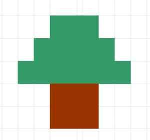 and build on their skills until they have the basics by fifth grade.
Then, we spend middle school applying those skills to lessons.
Over the next few months, we’ll provide a series of lessons on spreadsheet basics you can use in your K-8 classroom. Here are some of the topics we’ll cover:
- #74: Mastering Excel (for Beginners)
- #71: Beginning Graphs in MS Excel
- #70: Create a Timecard in Excel for Grade Two and Up
- #73: How to Graph in Excel
- #12: Create Simple Shapes in Excel
- #75: Tessellations in Excel
- #72: How to Check Your Math in Excel
- How to Use Excel to Teach Math Arrays
- #62: Email from Word (Or PowerPoint or Excel)
- #79: Excel Turns Data Into Information
–from 55 Technology Projects for the Digital Classroom. (more…)

#12: Create Simple Shapes in Excel

What’s the first thing you think of when I say, Excel? Numbers, right–turning data into information. That is Excel’s ‘killer app’, but the ingenious human brain has come up with another striking use for Excel: Drawing. I spent a long time trying to find a lesson that taught drawing in Excel, finally gave up and created my own” (more…)