 I’ve been on the hunt for a good–scratch that: excellent–Learning Management System for several months. There are a lot of options out there, but none had enough of the characteristics that most teachers I know look for with an LMS, namely:
- delivers content to students in a variety of formats
- tracks student progress on assigned activities
- assesses student learning (both formative and summative)
- provides for teacher-student and student-student communication
- intuitive to use for both teachers and students, to encourage daily access. It should be non-intimidating, non-threatening, even non-geeky, so stakeholders feel as comfortable as they would in a physical classroom
- works across all platforms–iPads, web, Chromebooks
- plays well with a wide variety of apps, such as Khan Academy
- easily monitors student progress, work, and learning
- includes reminders of activities
- communicates important announcements to students
- allows for co-teaching in a classroom (an arrangement that is growing in popularity)
- encourages parent involvement in the education journey
I know–sounds impossible. Then, an email from Otus showed up in my stream. It caught my attention because the conversation was straightforward, plain-speaking, and hit my high points. So I agreed to review it.
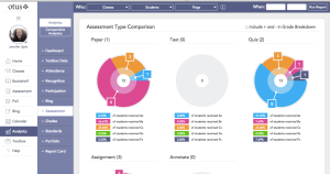
Otus is a free all-in-one mobile learning management system designed by teachers for teachers, available on iPads and desktops. Tools include all those I was looking for, as well as:
- an abbreviated Student Information System to go along with the class set-up
- student analytics to track not only student academic progress but absences and recognition badges
- the ability to tie lessons into a variety of standards, including customized ones
- student and teacher blog platforms
- a student resource area that can include anything with a weblink
- full access to Google Drive
- an ed pen to mark up math work (or any work)
Educators sign up for Otus, create classrooms, add students, and get started. Students can join with a class code.
 Pros
Pros
The interface is clear, intuitive, and easy to use. With a nominal sense of adventure and risk-taking, teachers and students can use Otus to stay organized.
There are no ads or in-app purchases. You can access it with a Google log-in.
To make this a tool my students and I could use in every class, every day, I asked the Otus folks I met with about system downtime. I wanted them to say ‘always on’, as reliable as the Pony Express and they said the equivalent: The server that powers Otus classrooms operates through an Amazon service. If you think Amazon is reliable, you’ll consider Otus reliable.
One last kudo: Otus has a YouTube channel with fourteen (maybe more) videos on how to use its features.
Cons
I learn fine with black-and-white text, but lots of my students rely more on visual presentations. I’d like Otus to have that available as a customized design option, where students or teachers could personalize their user interface to serve the need for color and pictures. Having said that, I have a similar complaint about most of the LMS programs I’ve evaluated.
I didn’t see any way to embed widgets into the program. Links–yes–but not those geeky embed codes that put the Wordle or Voki right onto the webpage. When I’m teaching a lesson that uses a webtool, I like to natively show it. Did I miss it? Anyone?
 Education Applications
Jacqui Murray has been teaching K-18 technology for 30 years. She is the editor/author of over a hundred tech ed resources including a K-12 technology curriculum, K-8 keyboard curriculum, K-8 Digital Citizenship curriculum. She is an adjunct professor in tech ed, Master Teacher, webmaster for four blogs, an Amazon Vine Voice, CSTA presentation reviewer, freelance journalist on tech ed topics, contributor to NEA Today, and author of the tech thrillers, To Hunt a Sub and Twenty-four Days. You can find her resources at Structured Learning.


