 Apps are out of control. When you think you have just the right one for your classroom, a better/faster/snazzier version pops up. Often for free. It’s not like a decade ago when every teachers’ favorite tech tools were MS Office, KidPix, Reader Rabbit, and the internet. Apps changed all that. Suddenly, the list exploded to include names like Voki, Tellagami, Wordle, ScreenChomp, Evernote and scores more that are weekly pushed aside by a new generation.
So before I unfold my favorites, here are guidelines to what I expected, culled from top education sites like Edutopia, Google Education, Educational Technology, and EdWeek:
- free or small fee
- support the ‘4 C’s’–creativity, critical thinking, communication, collaboration
- offer compelling content (although this is subjective; ‘compelling’ varies teacher-to-teacher and student-to-student)
- are not distracting or overwhelming in colors, music, or activity
- offer levels that become increasingly more difficult, providing differentiation for student needs
- stand the test of time
- positive parent reports
- few ads–and those that are there do not take up a significant portion of the screen
- intuitive to use with a short learning curve, encourage independence
- easily applied to a variety of educational environments
- doesn’t collect personal information other than user credentials or data required to operate the app
- rated ‘for everyone’ or ‘low maturity’
- no in-app purchases or billing
Based on these criteria, here are my top five:
Explain Everything
$2.99
Presentation and lesson-planning tool for teachers and Middle/High School students
Overview
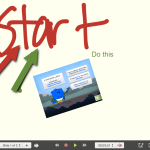
Explain Everything is an interactive whiteboard and screencasting tool that can be used to design a lesson, record student projects, and make presentations. Used by over 1.5 million students and educators (according to its creator, MorrisCooke), you can import and insert most formats of documents, pictures, and videos into a deck of slides, and then add voice-over, annotations, and notes (hand-written or typed) to explain the pieces. Items can be moved, resized, commented on, animated, and grouped with ease. Lectures and audio can be recorded and added to the screencast. The lesson canvas is infinite (think Prezi) allowing any number of pieces to be included and then zoomed in on to display. Once a project is complete, it can be uploaded as a pdf, an image, or a video to most major digital portfolios.
Pros
Explain Everything does a good job of meeting the 4 C’s–creativity, critical thinking, collaboration, and communication. It’s robust enough to differentiate for varied needs, from a simple slideshow presentation to a sophisticated media-rich video.
As is currently the norm for fee-based apps, there is no advertising.
Cons
I found the basic functions–the ones I would use often–easy to understand, even the first time. Failures were solvable rather than traumatic (where I lost all my work), but be forewarned: Users who try to click their way through rather than seek guidance from the website’s how-to videos may get frustrated. Of all five apps reviewed today, this has the steepest learning curve.
Insider tips
Look for a user manual on iBooks and help videos on the creator’s website that cover important functions.
Educational Applications
Teachers can create lesson plans in Explain Everything, then export to Google Drive to share with students. This is a great way to flip a classroom.
For Middle School and high school students, this can be a powerful tool to show evidence of learning.
Conclusion
For teachers seeking a lesson planning tool, this is a solid choice and compares favorably to other options like BlendSpace. For students interested in a fully-featured presentation tool that is media-rich and easily shared, this will become a favorite.
Design: 5/5
Functionality: 5/5
Fun Factor: 4/5
Availability: 4/5 (iOS, Android, Win8)
Overall: 4/5
Frog Dissection
$3.99
Grades 6-8
Overview
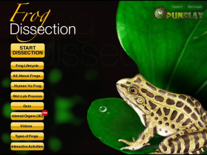
Punflay’s Frog Dissection app allows users to virtually dissect a frog, explore the amphibian’s life cycle, investigate worldwide species, and verify knowledge with a variety of short quizzes. The app is well-built with clean pages, no ads, and intuitive selections that make learning the goal, not maneuvering through a website. Despite the squeamish nature of the topic, even reluctant scientists will have no problem dissecting this pristine animal. Parents, too, will be pleased because there are no in-app purchases or billing (the only information collected is quiz scores).
Start by opening the app and selecting an activity:
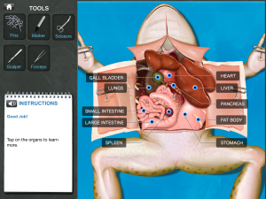
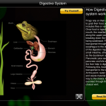
The most popular is the frog dissection, well-supported with tools typical to a real science lab, step-by-step verbal fail-safe instructions, meticulous labeling of parts, and interactive student participation:
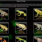
You can also take quizzes, explore the frog’s anatomic systems, study various species, and more:
Pros
This is a great option for schools without access to real frogs or students who have a legitimate reason for not dissecting a dead specimen.
There is virtually no learning curve. A voice-over guides users through the process with a blinking light over the animal part being discussed or tool required.
I found lots of positive reviews from educators who have used it in their classrooms like this one from TeachersWithApps and this one from Common Sense Media.
Cons
The app satisfies two of the 4 C’s–collaborative and communicative–but I found it lacking in critical thinking and creativity. The process is statically-defined with students guided so closely, it is impossible to make a mistake–literally–as they pick a tool, score the frog, pull the skin and muscle flaps aside, and remove organs. Everything is scripted with only one path–the correct path–available. If Winston Churchill is to be believed-–Success consists of going from failure to failure without loss of enthusiasm–the learning potential would be increased by allowing students to make the wrong choices and see where that takes them.
The app can’t provide the tangy smell of chloroform, the gritty feel of cutting through once-living flesh, the slip of the scalpel as hand sweats from nerves or concentration, the damp weight of organs–those sensory pieces only experienced with the real thing.
The voice-over is robotic. At times, it made suggestions that the student could not fulfill. For example, “Take care not to cut too deeply.” Unless the developer plans to add an option to the scalpel where the student chooses the pressure required to cut through skin and muscle, that comment belongs in a textbook rather than a simulation.
The organs are brightly colored with highly differentiated sizes so each stands out. That doesn’t match my experience. Often in the real world, internal organs share the same pinkish grey color with sizes that look disturbingly the same to a new biologist. These sorts of approaches make the process more an introductory tool than the end result.
There is no differentiation. Every student goes through the same process.
Student quiz results are tracked, but not dissection progress.
Only one log-in per device is allowed. This makes start-up fast, but means every student requires a separate account. Having said that, I only purchased the iPad app. The web-based application may be different.
Insider tips
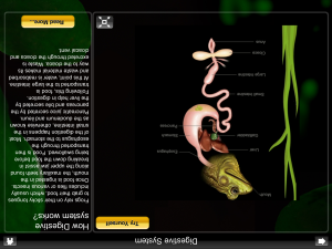
The program’s internal pages display upside down. No big deal–just rotate the iPad–but it is unusual.
Educational Applications
This is an excellent app for introductory botany and life sciences. It is colorful, appealing to users, with a wide variety of multimedia approaches to share information.
Conclusion
I expected to like this app, but found it lacking. Having experienced a virtual dissection, I better understand the long-standing scientific disagreement between the theoretical and practical sciences (for example, comparing Einstein’s Theory of Relativity to the reality of life). I am not surprised that a virtual dissection is touted by many as a perfect solution while others find it lacking.
Design: 3/5
Functionality: 4/5
Fun Factor: 4/5
Availability: 3/5 (iOS, Web)
Overall: 3/5
Leafsnap
Free
all ages, but best suited for Middle School and up
Overview
Leafsnap is the first in a promised series of electronic field guides being developed by researchers from Columbia University, the University of Maryland, and the Smithsonian Institution to use the science of facial recognition to identify trees. Currently, the database includes 184 tree species with illustrative examples of their flowers, fruits, petioles, seeds, and bark–most native to Washington DC, New York, and the northeast US.
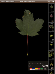
To use it, collect a full leaf, place it against a white background and snap a picture using the SnapIt! button.
The app searches its library of 2,590 high-resolution images and provides possible matches, leaving it to the user to make the final decision.
Once the species is selected, images of the tree’s flower, fruit, seed, and petiole can be viewed, and the leaf is added to the user’s library.
Alternatively, users can browse the database and search by leaf, flower, seed or berry.
Leafsnap automatically shares user images and the tree locations with the Leafsnap community (anonymously). By clicking the ‘Nearby’ button, users can see who else in their geographic area has identified the same tree. On a bigger stage, scientists will use the information to map and monitor population growth of the tree nationwide.
Pros
Leafsnap is easy to use with an intuitive interface and no advertising. Its backing from two major universities and the National Science Foundation make it a credible tool for amateur (or professional) botanists and nature lovers.
Besides botany, Leafsnap addresses critical thinking skills by requiring that students select a best fit to the leaf they’re trying to identify. This means they must evaluate the characteristics, compare/contrast the parts, and draw a decision based on evidence.
Cons
The app can’t be used in situ–by taking a picture of the leaf on a tree. There is too much background noise that interferes with the recognition program. The leaf must be collected and placed on a white background. If used for a nature walk, it will require two steps–one to collect the leaf and a second to identify it. This is easily solved by placing it against a notebook page, holding the notebook with one hand and snapping the picture with the iPhone app.
When the app can’t identify your leaf because of the quality of the picture, the app closes down. Then, you have to start over. I assume that isn’t intentional and will be fixed in updates.
The identification feature only works when the iOS device is connected to the internet via Wi-Fi or 3G, which is not practical when exploring the wilderness.
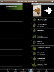
Leafsnap’s marketing says it will soon cover the continental US, but nothing has happened since 2011 when the app was first introduced. To understand what this means in terms of you the user, look at the difference between ‘Nearby’ sightings in my area of California and New York:
For New Yorkers, this is a robust, valuable database.
Insider tips
The first time you take a photo, the app automatically creates an account for you, after which you can go to the options screen and change your username and/or password.
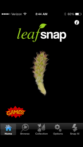
Games are available, but only when using the iPhone. They’re easy to find, with a big red ‘Games’ logo on the homepage:
Educational Applications
Besides the obvious botanic connections, students explore how technology is used to identify leaves. This introduces a conversation about facial recognition software and the ubiquitous security cameras. More relevant to students, discuss how social media sites like Facebook and Instagram are being used to identify and locate people through their online presence.
Scaffold on the identification process by pointing out the relationship between part and whole, and apply that to the relevant grade-level standards.
To recognize a leaf, the app requires students analyze, compare-contrast, and draw conclusions as to which tree is the best fit. This has lots of applications to Standards and curricula outside of botany and nature.
Conclusion
Design: 5/5
Functionality: 3/5
Fun Factor: 4/5
Availability: 3/5 (iOS)
Overall: 4/5
News-o-matic
Free to start; fee for monthly subscription
Younger readers
Overview
News-O-Matic is an interactive, subscription-based newspaper for ages 7-10. It offers compelling content across a wide variety of topics that encourages close reading and positive habits of mind. The site layout is busy without being overwhelming, interactive without being distracting. Every day, five news stories covering everything from world politics to celebrity stories are posted on the News-O-Matic main page. Stories are written in language 7-12 year olds understand, then reviewed by a child psychologist.
Articles include videos, pictures, maps, and more (in the right sidebar) which address a variety of learning styles. It includes a small dictionary to decode words (when you click a blue highlighted term, it pronounces the word and provides a definition) and a tool to find the distance between where students live and the event:
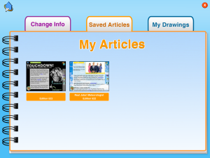
Students can annotate the article and save comments to their in-app digital portfolio.
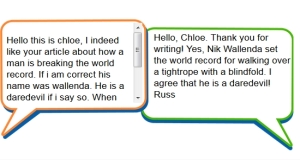
Other features include a Spanish translator, a rating tool, puzzles, a word game, “Read to Me”, write to the editor…
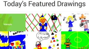
…and a simple drawing tool that allows pictures to be drawn in the app, saved to the app and shared with other users (anonymously):
Pros
News-o-matic supports all of the 4 C’s–creativity, critical thinking, communication, and collaboration--in organic ways that encourage deeper learning and a scaffolding of knowledge. It has received awards from the American Association of School Librarians, Smart Media, and more. I found it intuitive with a good balance of text, images, and other media.
Since it’s a fee-based app, I didn’t expect advertising and found none.
Cons
I was disappointed that only five articles were offered daily. For a monthly fee, I’d like more.
Educational Applications
This is an excellent way for teachers to offer non-fiction that interests students. It is ideal for schools struggling to meet the increased Common Core non-fiction requirements with age-appropriate, enticing material. Because these articles connect to the child’s world, even students who aren’t ‘readers’ will find something to be passionate about in the daily list.
A good way to bridge school and home is to have students read the news story and discuss it with parents, then share their conversation with classmates.
Conclusion
News-o-matic is easy to use–even the first time–age-appropriate, with lots of fascinating information for elementary-age students.
Design: 5/5
Functionality: 5/5
Fun Factor: 4/5
Availability: 5/5 (iOS, Android, Web)
Overall: 4/5
ScratchJr
ages 5-7
Free
Overview
ScratchJr is an introductory programming language for ages 5-7 similar to the wildly popular Scratch (for 3rd grade and up). ScratchJr adjusts Scratch’s interface and programming language to make it developmentally appropriate for pre-readers with features that match young children’s cognitive, personal, social, and emotional development. For example, optional video directions are all visual–no reading required. No voice even!
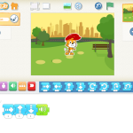
ScratchJr treats programming (a term that frightens even adults) as simply a creative way to communicate–another language. Start by opening the app:
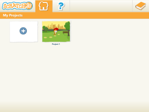
Click the ‘Home’ icon to access saved projects or open a new one:
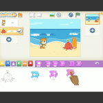
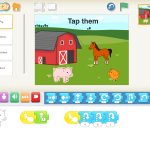
Write interactive stories and invent games by snapping together graphical blocks that make characters move, jump, dance, and sing. Modify characters in the paint editor, place them against different backgrounds, add sounds including your own voice, even insert personal photos:
Pros
With lively sounds, creative colors and shapes, ScratchJr does an excellent job of making programming available to early learners–before they learn how scary it is! Screens are bright without being distracting, sounds enticing without being overwhelming. The focus always remains on writing the story, building the game, and/or creating the video. No ads interfere with student work.
Cons
There is some discussion about whether programming aimed at students who can’t yet read is appropriate. Here is an article discussing that topic.
There is no way to export student work. A work-around would be to video the project using a screencast app like Explain Everything and then share it. Let’s hope the developers come up with a better method soon.
Insider tips
If you don’t know how to program, don’t worry. Scratch Jr. is about exploration, trial-and-error, and discovery. It’s not about you as teacher being the purveyor of perfect knowledge. Give students the iPad. Point them in the right direction, and let them go. They will discover everything they need. It’s not about product; it’s the process–critical thinking, problem solving and creativity.
Educational Applications
This is a great tie in for the Common Core K-1 Standards for Mathematical Practice. Additionally, use it in digital storytelling and recreating events in science and literacy units. Understand that the project will be as much about habits of mind as the specific inquiry topic addressed.
Conclusion
Because the app is expected to be self-taught and self-paced, students are empowered to learn on their own terms–no adult help required. No surprise they routinely rise to the challenge.
Design: 5/5
Functionality: 5/5
Fun Factor: 5/5
Availability: 5/5 (iOS–Android expected release date of 12/14; Web expected in 2015)
Overall: 5/5
There you have it–five apps that you can feel good about adding to your portfolio. If you’ve used these, what do you think of them?
More? Educational Technology shares a list of the top one hundred apps every educator should know about (half of them new to me). If you’re looking for top math apps, check out Laptop’s list here.
–published first on TeachHUB
More on great apps:
252 Favorite IPad Apps for your Classroom
5 Apps to Help You Reach Your Zen
Jacqui Murray has been teaching K-8 technology for 15 years. She is the editor/author of over a hundred tech ed resources including a K-8 technology curriculum, K-8 keyboard curriculum, K-8 Digital Citizenship curriculum. She is an adjunct professor in tech ed, CSG Master Teacher, webmaster for four blogs, anAmazon Vine Voice book reviewer, Editorial Review Board member for Journal for Computing Teachers, CAEP reviewer, CSTA presentation reviewer, freelance journalist on tech ed topics, and a weekly contributor to TeachHUB. You can find her resources at Structured Learning.
updated 5-18-16















Thanks for your post! With Explain Everything we are constantly trying to create as many entry points for different kinds of users and learners. We didn’t set out to create a ‘presentation tool’ though many people are using it that way. We just wanted people to be able to share ideas in new and hopefully interesting ways! All of your feedback is incredibly important to us and we will put some of your comments to work right away! Thanks for the positive review – we appreciate it!
I hear lots of positive buzz about Explain Everything. Keep up the good work helping teachers!
Another great source of curated apps and websites for learning is the American Association of School Librarian Best Apps for Teaching and Learning http://www.ala.org/aasl/standards-guidelines/best-apps/2014
Great addition. Thanks for adding that.