No one disagrees with the importance of the visual in communicating. The problem usually is creating it. Most teachers aren’t adept at matching colors, picking fonts and font sizes, and then laying everything out artistically. It’s much easier to use text with a few pictures tossed in and leave the artistry for the art teacher. When Microsoft Publisher came out a lifetime ago, it was the first major desktop publishing effort to blend layout, colors, and multimedia that was accessible to everyone. Unfortunately, it was (and continues to be) an expensive piece of software not traditionally included in Microsoft’s Office Suite (though that changed with Office 365). That meant MS Publisher skills learned at school were rarely transferrable to a home environment.
Canva changes that. It’s web-based (including apps available for iPads and Chromebooks) with a drag-and-drop functionality that makes the design process simple and intuitive. You can create professional presentations, posters, multi-page documents, marketing materials, social media graphics, and more using Canva’s more than 1 million photos, icons, and layouts, each with colors and fonts coordinated into attractive schema easily accessed by both beginners and reluctant designers. There’s no cost for basic (a yearly cost for premium) to use the thousands of free illustrations and images in the Canva library or uploading your own. For a small fee (usually $1.00), more than one million professional stock images and graphics can be used on a pay-per-use basis (most free with premium).
Educators: Visit Canva for Education to get how-tos, lesson plans, and teacher-oriented advice. One of my favorite features: Student designs can be shared, allowing teachers to view and add comments.
If you have never designed graphically before, start with the free Design School with how-to instructions on many projects and skillsets. There’s even a pithy collection of lesson plans. Follow the directions for the project as you create your own.
Here are thirteen of my favorite Canva education projects:
- Badges
- Brochures
- Certificates
- Charts and graphs
- Covers
- Fliers
- Greeting cards
- Infographics
- Magazines
- Presentations
- Resumes
- Venn Diagrams
- Visual organizers
Badges
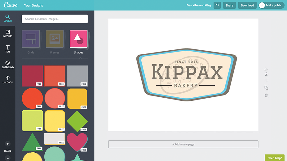
Badges are a great way to acknowledge student achievement in many class situations such as completing a skillset, forming a habit, finishing homework, not missing school, and even staying in seats during class. As these types of awards become more popular, teachers struggle with how to create them. Canva makes it easy. Simply select the shape, add text, and save/publish.
Covers
Cover pages add just the right amount of professionalism for reports, poetry collections, ebooks, a magazine, or any other project that shares curated knowledge. Pick a Canva template and then edit text and image. This is easily done in five minutes once students know what they’re doing.
Brochures
Trifold brochures are popular for assessing learning on any inquiry topic that expects students to acquire and share knowledge. Select from a scored brochure template, then add detail to each of the six panels. Publish/share/print.
Certificates
Certificates acknowledge a significant student achievement such as completion of a class or achieving a grade-specific standard. They can even be used for gift certificates (such as “skip a homework” or “skip an assignment”). Quickly create certificates by editing the text and image in a Canva template.
Charts and Graphs
Charts and graphs are a common approach to demystifying numbers. Most schools include robust units on using and understanding tables, charts, and graphs. Canva provides a quick method to organize data into a variety of charts including pie charts, bar charts, and line charts. This is a great first step for non-math classes and math-phobic students who think anything that sounds like a spreadsheet is outside of their skillset.
Fliers
Fliers have long been a popular way to distil the important topic information into one concise page. They can also be used to announce upcoming events or share holiday greetings. Canva provides a wide variety of templates with lots of fonts, colors, and image placement choices. One of my favorites is a collage of images in a variety of checkerboards, used as a background or the theme.
Greeting cards
I use greeting cards as formative assessments of student tech skills. They love creating these for family and friends and want to become proficient with the ability to add/edit text, add clipart, and design an attractive layout. Canva’s huge collection of templates and images enables students to focus on skills rather than the search.
Infographics
Infographics make a volume of complex information eye-catching, shareable and easily digestible. Canva’s templates share knowledge from a research project, clarify history, publish an event stream, or create a timeline of events.
Magazines
Because Canva allows you to link multiple pages into one project (exactly as you would in a magazine), it is a perfect way to create and share quantities of themed information presented in categories or subtopics. Students create a cover on one page, add a table of contents to the next, and then include the rest of their information via a visual organizer, Venn Diagram, or an infographic simply by placing one subtopic on each page. When they’re done, the magazine can be shared, printed, or displayed on the class screen via the Presentation mode.
Presentations
Presentations are excellent tools to help students share their knowledge in front of classmates or teachers to visually support a complicated talk. With Canva, this is done quickly with drag-and-drop pieces, the result being a professional presentation that includes text and images (you can’t add audio or video) and presented as a slideshow via Canva’s “enter presentation” tool. Youngers can use it as a digital portfolio of their work, sharable either on a digital device or the class screen at an end-of-year event. Older students can share knowledge in all the ways discussed in this article (such as a visual organizer, Venn Diagram, or an infographic).
Resumes
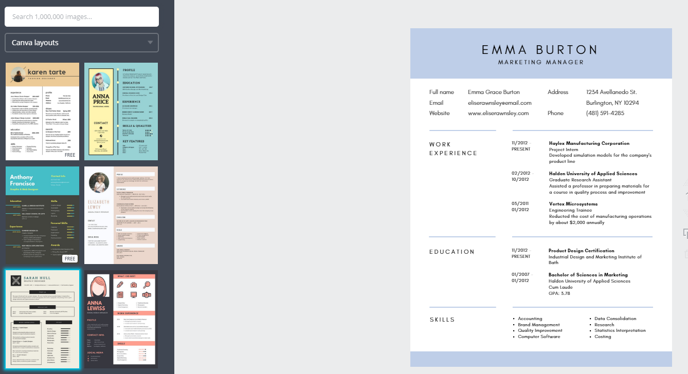
Resumes are a critical but oft-complicated requirement for students who are job hunting or applying to colleges. Canva makes it easy. All students do is pick a layout, enter data, and they’re done. Canva does the formatting, font selection, and attractive layout. This is perfect for high school career classes.
Visual organizers
Visual organizers (also known as graphic organizers) use creative layout, colors, graphics, and design to visually share information. For the many students who communicate better with color and design than text, this is a critical skill to assessing their knowledge. With Canva, simply pick a template, fill in the text boxes (or add more), replace images (or add more), and share/print/publish. These are great for sharing discrete knowledge, publishing a digital portfolio of projects, visually presenting a syllabus or collage of artwork, and showing how to solve a problem.
Venn Diagrams
Venn diagrams are the go-to method to compare-contrast data sets and determine the overlap in a visual, clear way. Canva provides easy-to-use templates with fill-in-the-blank options. Simply select the template and replace the elements.
***
Overall, Canva is a spot-on, fully-featured desktop publishing tool that is scalable to most workflows and rigorous enough for most projects. It levels the playing field for all students, from all backgrounds.
Here’s the sign-up link if the image above doesn’t work:
https://forms.aweber.com/form/07/1910174607.htm
“The content presented in this blog are the result of creative imagination and not intended for use, reproduction, or incorporation into any artificial intelligence training or machine learning systems without prior written consent from the author.”
Jacqui Murray has been teaching K-18 technology for 30 years. She is the editor/author of over a hundred tech ed resources including a K-12 technology curriculum, K-8 keyboard curriculum, K-8 Digital Citizenship curriculum. She is an adjunct professor in tech ed, Master Teacher, Amazon Vine Voice, freelance journalist on tech ed topics, contributor to NEA Today, and author of the tech thrillers, To Hunt a Sub and Twenty-four Days. You can find her resources at Structured Learning.


